Last updated: 10 May 2026
By Stiv · Design, technology and personal finance
Tracking Mobbin new apps each month is one of the fastest ways to spot where real product UX is heading without scrolling app stores for sport. May's batch is a proper mix: pet-tech, regulated healthcare with a fluffy mascot, and a high-profile fintech rebrand. In other words, three completely different categories, all worth opening side by side.
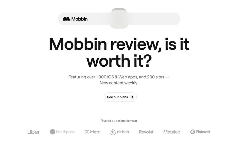
If you are new to the platform, start here first: Mobbin review: is it worth it? If you already know you want it and just want the cheaper route, head straight to our Mobbin promo code page.
What changed this month
May leans into category breadth rather than category depth. Instead of another batch of payment apps or another fintech onboarding, Mobbin has dropped flows from a connected pet collar, a French digital health insurer and the freshly rebranded Afterpay. Therefore, the through-line is less about features and more about brand voice.
Each new entry shows a different way of injecting personality into a regulated or category-defining product. So if you are working on anything where copy, tone or trust shapes the interface, this month is genuinely useful. For a quick overview of plans before you dig in, see our Mobbin pricing UK breakdown.
New and updated apps (May 2026)
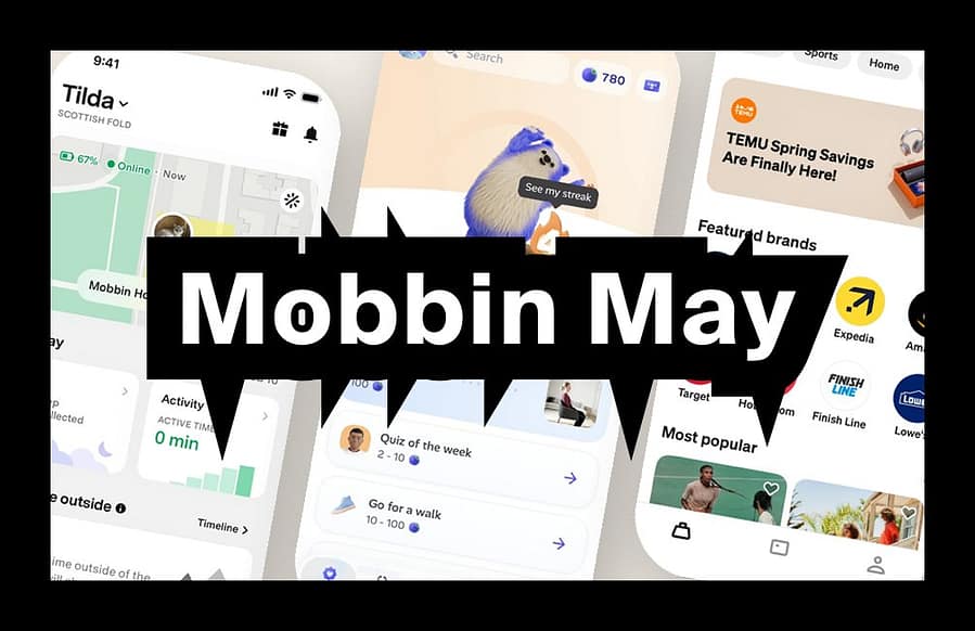
The standout additions this month are Fi (the smart dog collar tracking app, sitting under Mobbin's Health and Fitness category with 213 screens), Alan (the French digital health partner under Medical, with a hefty 682 screens) and a refreshed Afterpay flow that reflects its new shared identity with Cash App (208 screens, now categorised across Shopping and Finance).
Each one brings patterns worth studying, particularly around tone of voice, gamified compliance and brand consolidation after acquisition.
Three standout flows worth stealing
1. Niche made mainstream: Fi pet tracking UX
Fi is the GPS tracker collar app from Barking Labs. While it is currently US-focused, the design references are useful for anyone working on connected hardware, ambient telemetry or wellness dashboards. The app pulls together GPS location, step counting, sleep tracking and behaviour insights such as scratching, licking and barking. According to Fi's App Store listing, the Series 3+ collar even integrates with Apple Watch.
What to copy: the way Fi handles "Lost Mode" is a small masterclass in mode-shift UX. The map screen takes over, the location refresh rate increases visibly, and ambient features like activity ranking quietly step out of the way. Therefore, it feels urgent without feeling alarming, which is hard to pull off. Worth opening alongside the Fi onboarding flow on Mobbin, which walks through device setup, pet profile, shipment tracking and location sharing as four discrete steps. The membership pricing screen ($59 for three months on the Series 3+) is also a tidy reference for transparent subscription disclosure.
2. Personality in regulated UX: Alan
Alan is the first 100% digital health insurance company in France, and it has been a design-circle reference for years. Frankly, the Mobbin addition is overdue. The current screen set features Alan's fluffy white mascot all over the place, gamification through "berries" instead of points, and a tab bar that runs Today, Consult, Insurance and Optics, because Alan also sells glasses now.
Two details on the Mobbin page genuinely stand out. First, the back pain programme names individual sessions "The Beast", "The Panther" and "The Superman" rather than Session 1, 2, 3. Second, the reimbursement tracking screen describes a document review with the line "Our team is reviewing your documents with love and attention." That copy in a regulated insurance flow is, quite simply, exemplary. According to a recent profile by Lombard Odier, the app also integrates Mo, an AI health assistant, as part of a broader virtual clinic and prevention layer.
What to copy: tone of voice as a functional layer of the interface. Most insurance apps default to clinical neutrality. Alan, however, leans into warmth without losing precision. If you are designing anything in a heavily regulated category, this is the swipe file you want.
3. Rebrand without breaking trust: Afterpay refresh
Afterpay's Mobbin entry has been updated to reflect its visual consolidation with Cash App following the Block acquisition. The app icon is now a familiar twist of Cash App green, and that green threads through the whole interface, from the "Shop at Amazon" CTA to the search filters. Both the App Store and Google Play listings even include a "Same app. New Look." card explaining the shift.
One screen on Mobbin worth bookmarking: the "Create a single use card to use Afterpay at Amazon" flow. It is a tidy solution for the pattern of "this merchant doesn't natively support our payment method", and the explainer copy ("It's secure and can only be used once") does a lot of trust work in two short sentences.
What to copy: the calm, transparent way Afterpay communicates the visual change. The copy explicitly reassures users that "there are no changes to your Afterpay account, orders, or payment plans." Then the visual identity quietly does its job underneath. Consequently, this is a brilliant example of how to refresh a fintech product without resetting hard-earned trust. If you are working through an acquisition or rebrand, lift this change-management copy pattern wholesale.
The pattern of the month: brand voice as a UX layer
The thread tying these three together is brand voice as a functional layer of the experience. Nielsen Norman Group research shows that tone of voice has measurable effects on perceived friendliness, trustworthiness and willingness to recommend a brand. In other words, copy is not decoration; it is interface.
Fi balances playful (Lost Mode, social ranking, the "Refer a friend, get 1 month FREE" prompt) with serious (escape alerts, health monitoring). Alan turns regulated language into something genuinely warm. Afterpay leans on Cash App's irreverence while keeping the financial copy precise. All three could lose their voice and still technically work. However, they would lose the thing that makes users actually like them. That is a useful lens to take into your own product.
The reference apps everyone keeps stealing from
While you are in the library, it is worth re-opening the perennial favourites. Revolut, Airbnb and Duolingo remain three of the most heavily browsed app references on Mobbin, and not by accident. Revolut now sits at 656 screens spanning iOS, Android, Web and full marketing sites, which makes it the gold standard for fintech onboarding density. Airbnb (363 screens, Mobbin Awards Nominee 2025) has a refreshed tab bar with new Experiences and Services tabs, both flagged as recent additions and worth studying for vertical expansion patterns. Duolingo (547 screens, also a 2025 Awards Nominee) has expanded beyond languages into maths, music and chess, so the lesson library now teaches everyone how to do friendly gamification across multiple subject domains without being patronising.
Pair them with this month's drops and you have a tidy comparison set. Compare Revolut's account opening with Alan's onboarding. Then compare Airbnb's trust signals with Fi's "Lost Mode" framing, and Duolingo's streak mechanics with Alan's "berries" system. For a wider tooling comparison, our Mobbin vs alternatives page covers how it stacks up against Refero, Page Flows and 11FS Pulse.
How to actually use Mobbin's new apps in your work
Pick one flow you are designing right now (onboarding, AI handoff, lost-state recovery, change-management copy, gamified streaks). Then pull five to ten reference screens across the new apps and the perennial three. Notice what is shared and what is specific. Therefore, instead of designing in a vacuum, you are designing against a current corpus of working patterns. That is the entire point of the tool.
If you are part of a design team, the Team plan unlocks shared collections so you can build a swipe file together. See our Mobbin Teams plan guide to decide if it is right for your setup. Running an agency? Our Mobbin for agencies page weighs the pros and cons.
Try Mobbin and save with our promo code
If you are ready to try Mobbin, use our Mobbin promo code page to find the cheapest route into Pro or Team. Students should head to our Mobbin student discount guide instead.
More Mobbin reads on CoolCuration
- Mobbin review: is it worth it? — our honest verdict on the tool.
- Mobbin service guide — the full overview of features and plans.
- Mobbin promo code — the cheapest way into Pro and Team.
- Mobbin pricing UK — what each plan costs in pounds.
- Mobbin vs alternatives — how it compares to Refero, Page Flows and 11FS Pulse.
FAQs
What are the standout Mobbin new apps for May 2026?
Fi (smart dog tracking, 213 screens), Alan (French digital health partner, 682 screens) and the refreshed Afterpay (208 screens) following its Cash App rebrand. Each one targets a different pattern: connected hardware UX, gamified compliance with strong brand voice, and visual rebrand without losing trust.
Is this a Mobbin discount code page?
No. This is the monthly "what is new" post. If you want the discount route, use our Mobbin promo code page.
Where should I start if I am new to Mobbin?
Read the full verdict here: Mobbin review: is it worth it? For a broader overview of features and pricing, try our Mobbin service guide.
How much does Mobbin cost?
Pro is currently £8/month and Team is £10/member/month, both on yearly billing. Students get 50% off. Full details on our Mobbin pricing UK page.
Why track Mobbin new apps monthly?
Because it is the easiest way to keep a current swipe file of real product patterns. It also helps you avoid designing based on outdated screenshots from years ago. UX moves quickly, and so do brand voices.
Is Fi available in the UK?
Currently Fi is US-focused, with limited Canadian coverage. The app and collar rely on AT&T's LTE-M network, so it will not work in the UK. However, the patterns are still worth studying for any connected-hardware project.
More from CoolCuration
- Best banking app UK — for context on UK fintech UX as you compare against the Afterpay rebrand.
- Gift guide for designers — curated picks that go beyond the usual Pantone mugs.
- Daylight Computer — a beautifully different screen for designers tired of LCD fatigue.
- Rover pet sitting — pairs nicely if you went down the Fi rabbit hole this month.
- 1Blocker app — a quietly excellent privacy tool for iOS.
This page contains links to our Mobbin promo code page, which includes an affiliate referral link. Features and pricing can change. Always verify current details on Mobbin's official site before purchasing.
What's trending

Recent posts
- Premium Bonds vs Investing UK: Which One Suits You?
 Last updated: 21 June 2026 By Stiv · Design, technology and personal finance This article contains affiliate or referral links. If you click through and sign up I may earn a commission or referral bonus at no extra cost to you. It does not affect my editorial view. This is not financial advice. It reflects… Read more: Premium Bonds vs Investing UK: Which One Suits You?
 - How Does Sprive AutoSave Work?Sprive AutoSave2026 Guide Sprive AutoSave, explained in plain English Last updated: 21 June 2026 By Stiv · Design, technology and personal finance I have run my Nationwide mortgage through Sprive since October 2021, so more than four years now, making regular overpayments through the app. Because of that, this guide to Sprive AutoSave comes from… Read more: How Does Sprive AutoSave Work?
- Best Graduation Gifts 2026: 16 Cool, Unexpected UK FindsThe best graduation gifts for 2026: 16 design-led, unexpected UK finds for the creative, the traveller and the first-flat starter. Cool, not tat.


No Comments.