
By Stiv · Design, technology and personal finance
This article contains affiliate or referral links. If you click through and sign up I may earn a commission or referral bonus at no extra cost to you. It does not affect my editorial view.
Curation apps, agent front ends, and a ten-minute clock
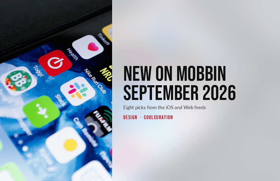
Everything new on Mobbin September 2026 sorted itself into two piles while I was reading it. One pile helps you keep track of what you already like. The other gives a software agent somewhere to stand. I went through the iOS feed and the Web feed separately on 5 September 2026, because the two surface completely different apps. Eight picks came out of it.
So there are four curation apps here, three products built around agents, and one image generator with a countdown timer on its paywall. Every screen described below is one I opened myself. Screen counts, ratings and flow names come from Mobbin on 5 September 2026. Prices come from each maker's own site on the same day.
Want a deal on Mobbin Pro?
The current saving on the paid plans lives on my promo code page, kept up to date so you do not have to go looking.
What is new on Mobbin September 2026? The eight picks are below. For every edition of the series in one place, see my Mobbin new apps hub, updated each month.
This month at a glance
Section 01 · Curation
Four apps for keeping track of what you like
Maps, feeds, wardrobes. Different objects, one job underneath. Hold the things you have decided are good, then make them findable again later.

corner
Corner International's app is a map of places your friends actually rate. It landed on Mobbin this month with 219 screens across 63 flows. The one I keep going back to is called Import places (notes or texts). Tap the plus and six options appear. They read create a post, create a list, collaborative list, import from IG & Tiktok, import from google maps, and import docs, notes, & texts.
Pick the last one and corner shows a plain textarea with a 10,000 character counter. Above it sits a line of guidance in the app's own lowercase voice. It reads "works best when the places in the list are all from the same region". A second line tells you to include the city name. Paste a Google Maps link and the button changes from "import list" to "import 2 lists" as it finds them. Afterwards a small speech bubble drops onto the map: "we'll ping you when the import's done".
The missing preview. You paste, you press start import, and then you wait for a notification. Nothing previews the places it recognised before the import runs. So a list that half-matches becomes a problem you meet later. The regional hint is honest about the failure case, but it does not stop it.
For anyone whose restaurant list lives in a note they never open
Free on the UK App Store · 4.5 from 80 ratings

Places
Places is a curated travel guide from Raya App Inc, the company behind the invite-only social app. That influence shows in the flow list. There is Enter an invite code, Curators, Curator profile and Manage membership. It arrived with 212 screens and 67 flows. Asking Places (audio input) is the five-screen one worth studying.
You tap the microphone, a waveform fills the input, and the reply is not a chat bubble. Instead the app sets the answer as a page. There is a serif headline reading "Top restaurant picks in California", a one-line standfirst underneath, then a shortlist with a photograph and a paragraph each. Below that comes a News & Notes block. One line of it reads "Anajak Thai released a new collaborative wine, Anajak Blanc V2". Then a section headed The pick explains the reasoning rather than just ranking. Follow-up chips read "Best in Northern California" and "Best in Los Angeles".
The sourcing gap. The typesetting borrows the authority of a magazine, but nothing on the screen says where any of it came from. Meanwhile the UK App Store listing sits at 2.9 from 17 ratings. Reviewers there name out-of-date venue information and a membership wall in front of the core features.
For the design of the answer, whatever you think of the answer
Free to download with paid membership · iPhone only

Curater
Curater calls itself a platform for curating and discovering taste, and it turned up with 81 screens and 32 flows. Sign-up runs across an acid-green panel scattered with purple dots. Next comes a display name, then a username field with an availability tick and a shuffle button beside it. Then the For You grid loads.
Here is what makes it different from every other moodboard. Each pin carries a short piece of writing in the curator's own voice, a category label in small caps, and a byline. One card reads "Paintings by Rodrigo Branco. I came across Rodrigo's work on the cover of Yago o Proprio's album"; another covers the artwork on Felbm's record by the Dutch illustrator Joost Stokhof. Categories run ART & DESIGN, MUSIC & SOUNDS, INDUSTRIAL DESIGN. There is a tab simply called Taste, and a flow called Applying as a curator.
The supply problem. Because the writing is the product, a card with a thin note on it is a dead card. Curater has no obvious way to raise that floor. Gating who can post, through that application flow, protects quality and caps volume at the same time.
For anyone who thinks a moodboard should come with sentences
Free to sign up · curating is by application

Alta
Alta Daily, from Flagship AI, photographs your clothes and files them. It landed with 364 screens across 111 flows. Filtering closet runs to six screens, and it is the one I would put in front of a team. The sheet offers Category, Dress code, Colour, Brand, Season, Tags, Fit and Item length. Under those sits a checklist: Tops, Bottoms, Dresses / Jumpsuits, Shoes, Bags, Outerwear, Jewelry, Accessories and Other Pieces.
So far this is a shopping filter pointed at a wardrobe, which is a good idea. Real brands are attached to items where Alta recognises them: Saint Laurent, Visvim, Alaïa, Gentle Monster, New Balance. Anything it cannot place reads "Unknown Brand", which is a graceful way to fail.
Then you tick Tops and Bottoms together. The counter drops to 0 items and the screen says "No items with current filters." Underneath that sits a heading reading "Items you may own". A shelf of garments follows it, each with a plus button: Light Blue Wide-Leg Jeans, Denim Jacket. The empty state of your own wardrobe is a shop.
The blurred line. Nothing on that screen separates the clothes you photographed from the clothes Alta would like you to add. Both sit under the same plus button. As an interface decision it is efficient. As a signal about what the app is for, it is quite loud.
For the moment a wardrobe filter turns into a shopping filter
Free with in-app purchases · 4.9 from 1.2k UK ratings
Filter your own wardrobe down to nothing, and the answer is a shelf of things you might buy.
Alta, Filtering closet, screen five of six
Section 02 · Agents
Three products that gave an agent a front end
Last year the design problem was how to ask a model for something. This month it is how to watch one work, and where to put the controls.

MagicPath
MagicPath describes itself as the shared workspace for humans and agents. It arrived with 246 screens and 76 flows. Open a project and the canvas asks "What would you like to design?" with four cards under it. Connect Agent comes first, and its subtitle reads "Work with Codex, Claude Code, or Cursor". The other three are Import from Figma, Import from Web and Start from a design system.
The left rail splits into Agent, Components and Libraries, with a Threads list above the prompt. Ask for a focused study app and the panel answers in stages. First a collapsible Thought process, then a line reading "App structure planned." After that comes a card named FocusFlow, tagged "Mobile · 4 screens", carrying a five-swatch palette labelled Primary, Secondary, Accent, Background and Surface. A footer counts 3 shared blocks. The composer reads "Ask for a design, @ or select on canvas to reference, or / to use skills". A Visual edits toggle and a model picker sit on the same row.
The four doors. Every entry card assumes you arrive holding something already. It wants an agent, a Figma file, a website to capture, or a design system. Nothing covers starting from nothing, which is the state most people are in when they open a design tool.
For a canvas that treats a coding agent as a file format
Web app · plans listed on magicpath.ai

Bloom
Bloom, a Y Combinator company, calls itself the brand layer for agents. You upload your guidelines and assets and it builds one system out of them. Everything it generates afterwards stays inside those rules. It came in at 147 screens across 43 flows.
Look at the left-hand navigation, though. Overview, Images, Ideas, Ad Library tagged NEW, Uploads, Brand. Then, in the group at the bottom where products normally park Help and Feedback, two more entries appear: Claude and MCP. Bloom has given a protocol a menu item, and parked it next to Discord.
The Images view earns its place too. A Get Started panel invites you to "Recreate ads from top Software brands" or to "Create your own image". A Brand card carries swatches labelled Modern, Professional, Clean and +2. The credit balance sits in the top bar, so every generation has a visible price. The composer offers an Image Assist toggle, an output size of 2K and a 1x multiplier before you press Create.
Modern, Professional, Clean. Those three words are doing the work of a brand strategy. They are also the three words any brand system would produce if asked to describe itself. A tool that promises consistency has to say what it is consistent with, and the labels here do not.
For putting MCP in the sidebar, next to Help and Discord
Credit-based plans · API and MCP access on every tier

Mesh
Mesh is a personal CRM whose own line is "Every relationship, remembered". Its assistant answers to Nexus, an AI navigator for your network. There are 224 screens and 73 flows in the library, and Connecting an account is only three of them. It still tells you most of what you need to know.
Screen one of three is headed Connect Accounts. Under it runs the line "Connect at least one account to get started." Six rows follow: Google, Microsoft, LinkedIn, Twitter, Contacts and iMessage. Tap Google and a sheet explains that "Most members connect both calendar and email to start". It then adds "Remember, Mesh cannot edit or delete your data, and everything is stored privately & securely". Calendar and Email toggles arrive already on. Connect, and the row fills with your address. A clear button appears, and a new option offers to Connect multiple accounts.
The order of the trade. Continue stays greyed out until something is connected, so the ask is a gate rather than a suggestion. It also arrives before you have seen a single thing the app can do. The reassurance inside the sheet reads well, which tells you how much reassurance the moment needs.
For an onboarding that wants your inbox on screen one of three
Free tier · macOS, Windows, Web, iOS and Android
Section 03 · Paywalls
And the biggest drop of the month
One app put 557 screens into Mobbin in a single drop, and the most carefully drawn of them are selling the subscription.
Higgsfield
 The offer modal, its countdown, and the pricing grid behind it.
Higgsfield is an AI-native creative suite, and it is the largest single addition to Mobbin this month at 557 screens. Mobbin members rate it 5.0 from ten ratings. Subscribing a plan runs to five screens. I would put it in front of any product team arguing about a pricing page.
It opens sensibly. A modal headed "Maximize Your Generations" compares Ultra, Plus and Starter by monthly output. It does it model by model: Nano Banana Pro 2K, Seedance 1.5 Pro, Kling 3.0, Kling Motion Control, Google Veo 3. That is a useful way to price a credit product, because it answers the only question anyone has.
Then the confetti arrives. A gift box appears, with a line reading "Congrats, you are in 5% who receives this offer". Behind it, a wall of pink and lime type announces a personal 54% off. A promocode marked _PERSONAL_PROMO is already applied. A counter reads 09 : 58 in minutes and seconds, and a lime button says Claim Discount. Dismiss it and a pink banner takes over the pricing page. It carries a second clock: "One-time Offer Expires in… 00 Hours 11 Minutes 55 Seconds".
The moving discount. The annual toggle carries a 59% off badge on one screen and 54% on another. PRO carries a 38% off badge on one screen and 40% on another. Its price moves between $18, $28 and $26 a month across the same five screens. A discount that is personal to you does not usually change while you are looking at it.
For 557 screens, and a ten-minute clock on the one that sells
Basic $9 a month billed annually · Pro and Max above it
What this month says about interfaces right now
Two patterns ran through what is new on Mobbin September 2026. The first is curation as a product category rather than a feature. corner, Places, Curater and Alta all solve the same problem in different rooms. All four have decided that the hard part is retrieval rather than storage, so all four ship a real filter bar. Alta's is the most literal, because it applies shopping facets to clothes you already own.
The second pattern is the agent getting furniture. MagicPath puts Connect Agent first on an empty canvas. Bloom gives MCP a navigation item. Mesh names its assistant Nexus and builds the whole onboarding around feeding it. In each case the design work has moved on from the prompt box. It now sits on permissions, provenance and progress, which are harder and much less photogenic problems.
The third thing is less flattering. Across all eight picks, the screen with the most design effort in it is a discount modal with a countdown on it. Higgsfield's comparison table is careful, honest work, and the offer that follows it is neither. Both sit inside the same five-screen flow, and only one of them got the confetti.
If you are new to this, my full Mobbin review covers what a subscription actually gets you. My Mobbin service guide explains how the plans differ. Last month's edition covered Brick, Opal, Magnific, Railway and Monzo, so there is no overlap with the eight above.
Frequently asked questions
What was new on Mobbin September 2026?
Eight picks stood out to me. On iOS: corner, Places, Alta and Mesh. On Web: Curater, MagicPath, Bloom and Higgsfield. Higgsfield was the largest single addition at 557 screens. Apple Music also arrived on the Web side with 159 screens, including a flow marked Chart detail.
How much does Mobbin cost in 2026?
Mobbin Pro is £8 per month billed yearly for individuals and freelancers. Team is £12 per member per month billed yearly. I checked both on the official pricing page on 5 September 2026. Enterprise is quoted rather than listed. Pro adds animations, unlimited collections, Deep Search, MCP access and the option to hide screen footers. Students and educators can apply for a discount.
Is there a free plan?
Yes. Browsing Mobbin works without paying, which is how most people use it. The paid tier mainly buys search depth, unlimited collections and the export tooling. So it earns its money once you reference screens weekly rather than occasionally.
Do these apps all work in the UK?
corner, Places and Alta are all on the UK App Store. Curater, MagicPath, Bloom and Higgsfield are web products that need no store at all. Mesh publishes apps for macOS, Windows, Web, iOS and Android. Places is the one to check first, because its core features sit behind a paid membership.
Which flow should a designer study first?
Higgsfield's Subscribing a plan, and not because it is good practice. It shows a careful comparison modal and an aggressive countdown offer inside the same five screens. So you can see exactly where a product stops explaining and starts pushing. corner's import flow is the better model to copy.
Why cover both the iOS and the Web feeds?
Because the two lists barely overlap. Sorting by latest on iOS gave Claude, MacroFactor, Glovo, Chick-fil-A, corner and Mesh. The Web list opened with v0, Higgsfield, Apple Music, Basecamp and Canny. Checking only one would have missed half the picks above.
More from CoolCuration
- Structured app review: the day planner that survived a month on my home screen.
- How to switch from ChatGPT to Claude: move your history across without losing the useful bits.
- Penpot: the open source design tool worth a look if Figma's pricing has annoyed you.
- Shop app: parcel tracking that tidies up the post-purchase mess.
- Gift guide for designers: objects worth owning, chosen for people with opinions about type.
What's trending

Recent posts
- New on Mobbin September 2026: corner, Higgsfield and MagicPath
 Eight apps and flows new on Mobbin in September 2026, from corner and Curater to Higgsfield's countdown paywall.
 - iPhone 18 Pro and iPhone Ultra: What to ExpectLast updated: 7 September 2026iPhone 18 Pro By Stiv · Design, technology and personal finance Nobody outside Apple knows whether a phone called the iPhone 18 Pro exists. What Apple has confirmed is a date. Wednesday 9 September, 6pm UK time, at an event it is calling Surprise and shine. Everything else you have read… Read more: iPhone 18 Pro and iPhone Ultra: What to Expect
- Best Gifts Under £50 UK: 14 Design-Led PicksFourteen gifts between £25 and £50, from a self-build 35mm SLR to a Hockney tray. Every price checked at the shop on 4 September 2026.

No Comments.