
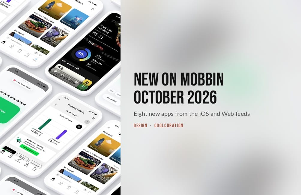
Last updated: 7 October 2026. I opened every flow in this new on Mobbin October 2026 roundup myself on 29 September 2026.
By Stiv · Design, technology and personal finance
This article contains affiliate and referral links, which are paid links. If you click one and buy or sign up, I earn a commission or referral bonus at no extra cost to you. Brands don't choose what I feature or what I say about them.
Consent screens, questions about your own data, and a lock you set on yourself
Everything new on Mobbin October 2026 came from two feeds. The iOS feed and the Web feed surface completely different apps, so I picked four from each. As a result, eight flows made the cut, and every screen described below is one I downloaded myself.
Along the way, three patterns kept turning up. Delphi and Sweatpals both ask you to agree to something large inside a single tick box. Lloyds, Dropbox Dash and Mindtrip each let you ask questions about your own data. Meanwhile Jomo, the screen time blocker, makes you type out why you want an app back before it lets you in. Screen counts and ratings also come from Mobbin on the day I checked. Prices come from each maker's own site or the UK App Store, checked on 29 September 2026.
Want a deal on Mobbin Pro?
The current saving on the paid plans lives on my promo code page, and I keep it up to date each month.
What is new on Mobbin October 2026? The eight picks are below. For every edition of the series in one place, see my Mobbin new apps hub, updated each month.
New on Mobbin October 2026 at a glance
Section 01 · Consent
Two sign-ups that ask for a lot in one tick
One wants your voice and your ID. The other wants a signed liability waiver for a free beach workout. Both collect the big agreement in a single checkbox.

Delphi
Delphi builds an AI version of you that other people can chat to and call. Its homepage headline is "Digitize Your Mind". It arrived on Mobbin with 203 screens across 61 flows. Of those, the Onboarding flow alone runs to 24 screens.
First you confirm your email with a six-digit code. Next, a modal headed Terms of Service appears with one checkbox. It reads "I agree to the Terms of Service and consent to the use of my biometric data as described in the Privacy Policy." After that, you verify a phone number by text message. Then you enter your name, because "Every Delphi represents a real person". You prove that name with LinkedIn or a government ID, and "The name must match exactly."
Only after all that does the product part start. You claim a handle, connect up to seven accounts from LinkedIn to TikTok, and write answers to the questions people ask you. Finally, a screen named after your digital double asks you to train it on your voice, with a script to read aloud. While it builds the clone, a loading screen says "Calibrating your mind".
The bundled biometric consent. Because the terms and the biometric data sit in the same tick box, you cannot accept one without the other. The voice step later offers "Do this later", so recording is optional. By then, however, you have already agreed to the biometric use.
For anyone designing a sign-up that has to verify a real person
Free plan · Builder $79 a month, priced in US dollars

Sweatpals
Sweatpals is a platform for finding and booking fitness events, from run clubs to sound baths. It came in with 256 screens across 73 flows. The flow I spent longest on is Registering for an event, which takes six screens to book a free men's beach workout in Chicago.
At first, the event page shows the price as Free and a Register button. At checkout, however, a panel headed Review Waiver holds a scrolling participant waiver and release of liability. It covers voluntary participation, assumption of risk, release of liability and medical treatment. Near the bottom sits a Photo & Video Release. It grants the organiser permission to use photos and videos of you "for marketing, social media, and promotional purposes without compensation." Even so, one checkbox covers the lot, and the Register button stays grey until you type your initials.
After that, the confirmation screen is tidy. It offers a ticket PDF, Add to calendar and Invite friends. However, below them, a row to join the organiser's community and receive notifications arrives already ticked.
The photo release inside the waiver. Agreeing to take responsibility for your own injuries also hands over the rights to your picture, because both sit under the same tick. Sweatpals lists its events across US cities, so for a UK reader this one is a design reference rather than something to book.
For the sign-with-initials field, and what sits above it
Free to browse · hosts set the ticket price, from free upwards
Section 02 · Your own data
Three apps that let you ask about yourself
A bank you can question in a sentence, a search box that learns your filters, and a travel app that interviews you out loud.

Lloyds Mobile Banking
The biggest iOS drop of the month is a British high street bank: 461 screens across 123 flows. Chatting with Lloyds AI is four of them. It starts from Spending insights, where a tile reads "Chat with your money for AI-powered responses" above an Ask a question button. Lloyds calls the feature Explore your spending.
Next, the welcome screen carries a green BETA badge and four suggested questions. One asks "How many purchases under £10 have I made in the last week?" Another asks "Which top merchants did I spend the most at last month?" When you tap "How much have I spent at AMAZON this year?", the reply is one sentence with a total and a count of 58 transactions. Then, directly underneath, the app lists those transactions with dates and amounts, plus a Show more link. Therefore you can check the number against the payments that make it up.
The capital letters. The suggested question shouts AMAZON because it copies the merchant name straight off the statement, while the answer says Amazon. Also, every screen shows a 0/256 character counter under the input, before you have typed a word.
For showing the working under an AI answer
Free on the UK App Store · 4.8 from 2.6 million ratings
If you are comparing the apps themselves rather than their screens, my guide to the best banking app in the UK covers what each one does day to day.

Dropbox Dash
Dropbox Dash searches across Dropbox and the other apps you connect to it, including Gmail, Google Drive and Notion. Its own line is "Find anything. Protect everything." It arrived with 323 screens across 80 flows, and Filtering search results is six of them.
The search starts as a keyword followed by "type:image", with tabs for All, Images, Videos, Visual matches and File name. A filter button opens Type, App, Updated, People and Sort. Then pick Dropbox from the App list, and "in:dropbox" appears in the query. Choose a person and a "from:" address follows. So after two clicks you can read the exact syntax you would need to type next time.
Enabling privacy mode is also worth three screens. An eye icon in the bottom corner, labelled only by a tooltip, blurs the names of your chats and stacks in the sidebar.
The query that runs off the edge. When you add an email address, the query is longer than the box, so the end of the address is cut off. As a result, you cannot see the whole search you just built without scrolling inside the field.
For filters that write the query out as text
Teams from $15 per user a month billed yearly, priced in US dollars · 30-day free trial

Mindtrip
Mindtrip is an AI trip planner whose line is "AI-powered travel, personalized to you". It landed with 325 screens across 98 flows. Starting a voice interview is a seven-screen onboarding that replaces the usual preference form with a conversation.
First, the opening screen explains the plan in the first person. "I'm going to ask a few questions about those places you've loved, experiences you've enjoyed, and the things that matter most when you travel." Tap Start voice interview and a single waveform button cycles through "One moment", "Mindtrip is speaking" and "Listening". Meanwhile the transcript appears word by word as the voice speaks, turning from grey to black. A thin progress bar and a Skip interview button also stay on screen throughout.
At the end, "You're all set" explains what happens next: "I'll use what you shared to make your recommendations more personal." Five suggested trips follow, starting with Plan a trip to London.
The places it already knows. The first question opens with "I see you've spent time in some great places, like New York City and Spain." However, nothing on the screen says where that came from, so the most personal line in the flow arrives without an explanation.
For a progress bar on a conversation
Free on the UK App Store · 4.8 from 73 ratings
I'm recording audio to clone my voice. Afterwards, I'll be able to produce speech that sounds just like me.
The script Delphi asks you to read aloud, Recording a voice, screen one of four
Section 03 · Agents and live data
An agent in the activity log, and a race on the lock screen
A documentation tool that lists its AI as an author, and a Formula 1 app built around one Live Activity.

Mintlify
Mintlify hosts documentation sites and now calls itself "The knowledge platform built for agents". It arrived with 356 screens across 103 flows. Generating a site is five of them, and it starts with a box that asks you to describe what you want or paste a website link. Beside it, similarly, sit Add GitHub repo and Upload file, plus "Skip, start from a blank template".
Once you submit, a banner explains the wait: "Agents are at work building your starting point. This usually takes 10–15 minutes. We'll send you an email once it's finished." Later, when you come back, the dashboard shows the live site and an Activity table with Update, Status and Changes columns. In addition, one row lists mintlify itself as the author. Its note begins "docs: review pass" and lists fixes to SEO metadata, factual accuracy and component compliance across 16 files.
The empty Changes column. The agent's row explains what it did and how many files it touched. Meanwhile, the Manual update rows above and below it leave the Changes column blank, so the log tells you more about the agent's edits than about the people's.
For putting an agent in the same log as the people
Starter plan free · Pro $450 a month, priced in US dollars

Box Box Club
Box Box Club is an independent Formula 1 widget app, and it says clearly that it has no link to Formula 1, its teams or its drivers. It arrived with 200 screens across 63 flows. Although Starting a live activity is only three screens it shows how much a sports app can fit above the fold.
On the home card, it reads Start Live Tracking, with "Belgian GP • Practice 2 Ends in" over a large 31:31 countdown and a red Live button. Underneath that, a ring shows 40%, next to three season stats: 9/22 GP Completed, 2712.4KM Covered and 561 Laps Completed. Then tap Live, and a dialog confirms "Live Activity Started! You can now track the session live from your Lock Screen".
The hidden auto-start. Tap before a session begins and a dialog says "The session hasn't started yet!" It then tells you to turn on Auto-start from Widget Settings. Until then, the flow never mentions the option, so you only find it by getting the timing wrong.
For fitting a whole race weekend onto one card
Free on the UK App Store · 4.6 from 1,715 ratings · Box Box Ultra from £3.99
Section 04 · Friction
The lock you set on yourself
Jomo adds steps on purpose, and the user decides how many.
Jomo
 Jomo's recopy option, the reason prompt and the unlock timer.
Jomo is a screen time blocker with 345 screens across 85 flows on Mobbin. However, its unlock methods are what make it worth studying. A sheet headed "Before each unlock..." offers seven options. They are Give a good reason, Recopy a painful text, Recopy a random code, Prove with a photo, Enter a password, Scan and Look at yourself.
For example, pick Recopy a painful text and a preview shows the sentence you will have to type out. "Yes, I could use this time better. I know I could be doing something better right now. But I'm choosing to spend this time on this app and I accept that." The rule screen then adds up your allowance, for example two 15-minute unlocks for "30min max."
By comparison, Give a good reason is the lighter version. When you open a locked Apple Music, a sheet asks "Do you really want to unlock?" above a large blue card that says "Enter intention here...". Next, your reason appears on a green card while you choose 1, 2 or 5 minutes. Meanwhile, the rule greys out the longer options. A green banner then confirms the unlock, and the lock counts down.
The unchecked reason. However, nothing reads what you type. "I need to reflect" unlocks the app as well as any other sentence, so the method works only as well as you are honest with yourself. Unless Strict Mode is on, you can also edit or delete the rule itself.
For friction the user sets on purpose
Free · Jomo Plus £5.99 a month, £29.99 a year or £79.99 lifetime · 4.8 from 454 UK ratings
What new on Mobbin October 2026 says about app design
First, the consent step is getting heavier. Delphi asks for biometric consent, a phone number and a verified name before you see the product. Sweatpals puts a photo release inside a liability waiver for a free workout. In both cases one checkbox carries more than one agreement. Jomo goes the other way, because the only thing you agree to is a sentence you type out yourself.
Second, more apps now let you question your own data directly. For instance, Lloyds answers in one sentence and then lists the 58 transactions behind the total, so you can check it. Similarly, Dropbox Dash turns each filter into text you can read and reuse. Finally, Mindtrip swaps the preference form for a spoken interview. Of the three, only Mindtrip leaves a gap, because its opening question mentions places you have been without saying where it learnt them.
Third, agents are turning up as named authors. Mintlify lists its agent in the same activity table as the people who edit the site, with a clearer note than they leave. By contrast, last month the pattern was agents getting a front end. This month they are also getting credit in the log.
If this is your first edition of the series, the eight apps new on Mobbin October 2026 are a good place to start. My full Mobbin review covers what a subscription actually gets you. My Mobbin service guide explains how the plans differ. Meanwhile, Mobbin's own site lets you browse the free tier before you pay.
Frequently asked questions
What was new on Mobbin October 2026?
The eight picks new on Mobbin October 2026 split evenly. On iOS: Lloyds Mobile Banking, Mindtrip, Box Box Club and Jomo. On Web: Delphi, Sweatpals, Dropbox Dash and Mintlify. Lloyds was the largest of them at 461 screens, and Jomo is the one I would study first.
How much does Mobbin cost in 2026?
Mobbin Pro is £8 per month billed yearly for individuals and freelancers. Team is £12 per member per month billed yearly. I checked both on the official pricing page on 29 September 2026. Enterprise, however, has no listed price, and Mobbin also offers quarterly billing. Pro adds flows, animations, unlimited collections, Deep Search, MCP access and the option to hide screen footers. Students and educators can apply for a discount.
Is there a free plan?
Yes. You can browse Mobbin without paying, and that is how most people start. In short, the paid plan mainly adds full flows, search depth and unlimited collections. Still, it pays for itself once you reference screens every week rather than now and then.
Do these apps work in the UK?
Lloyds, Mindtrip, Box Box Club and Jomo are all on the UK App Store, and Lloyds is a UK bank. Delphi, Dropbox Dash and Mintlify are web products you can sign up to from here, and the last two price in US dollars. So most of what is new on Mobbin October 2026 works from here. Sweatpals is the exception, because it lists its events in US cities.
Which flow should a designer study first?
Of everything new on Mobbin October 2026, start with Jomo's unlock methods, because each one is a different amount of friction and the user chooses which. After that, look at the Lloyds answer screen. It shows a clear way to put the evidence directly under an AI-generated number.
Why cover both the iOS and the Web feeds?
Because the two lists barely overlap. For example, sorting by latest on iOS opened with Public, Tolan, Sweatcoin, Ro and Mindtrip. Meanwhile, the Web list opened with Calendly, AirOps, GetYourGuide, Base and H&M. Checking only one would have missed half the picks above.
More from CoolCuration
- 1Blocker: the content blocker to pair with a screen time app if ads are what keep pulling you back.
- Mobbin vs alternatives: how Mobbin compares with Refero and Page Flows before you pay for any of them.
- Best eSIM for UK travellers: sort your data before you let a trip planner book the rest.
- Gift guide for techies: presents for people who already own every gadget.
- Projecting British Design: a book on how British design sold itself, for anyone who collects references on paper.
What's trending




Recent posts
- New on Mobbin October 2026: Jomo, Delphi, Lloyds and More
 New on Mobbin October 2026: Jomo, Delphi, Lloyds and five more apps, with the consent, search and unlock screens worth studying.
 - British Art Fair 2026 ReviewArt fairsSaatchi Gallery A Sickert study best in show, a Hockney for £800, and naff AI art Last updated: 28 September 2026. I checked every price and date in this British Art Fair review against the dealers' labels and the fair's own pages. By Tristan · Arts, exhibitions and creative culture This is an opinion… Read more: British Art Fair 2026 Review
- Quentin James McCaffrey at Alison Jacques ReviewLast updated: 6 October 2026 By Tristan · Arts, exhibitions and creative culture This is an opinion piece. Views expressed are the author's own and do not constitute professional advice. Cool Factor: 3/5 Quentin James McCaffrey's first UK solo show was on at Alison Jacques from 3 September to 3 October 2026. Comprising fifteen small… Read more: Quentin James McCaffrey at Alison Jacques Review

No Comments.