Last updated: 2 April 2026
By Stiv · Design, technology and personal finance
This article contains affiliate or referral links. If you click through and sign up I may earn a commission or referral bonus at no extra cost to you. It does not affect my editorial view.
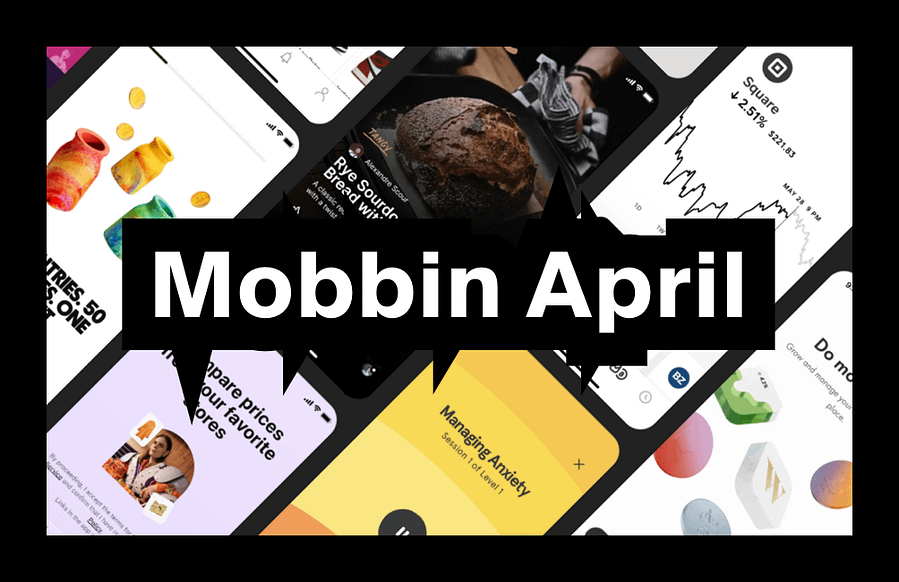
Tracking Mobbin new apps each month is one of the fastest ways to spot where real product UX is heading without scrolling app stores for sport. April's batch has a clear theme: AI agents are moving out of chatbot demos and into real products people actually use every day.
If you are new to Mobbin, start here first: Mobbin review: is it worth it? If you already know you want it and just want the cheaper route: Mobbin promo code.
What changed this month
April brings a mix of connected hardware, AI-powered commerce, streaming and productivity. The thread running through the batch is AI moving from novelty to utility. These are not concept demos. They are shipped products where AI handles phone calls, negotiates prices and manages physical objects like cars and charging schedules. That makes the UX patterns worth studying closely, especially if you are building anything with AI features right now.
If you want to browse these flows yourself, you will need at least Mobbin's free tier (though Pro unlocks the full library). Here is a quick breakdown of what each plan costs: Mobbin pricing UK.
New and updated apps (April 2026)
This month Mobbin added Polestar (EV companion), Paramount+ (streaming), Beside (AI receptionist) and Nibble (AI negotiation for ecommerce). They also updated Pinterest and Apple Reminders with refreshed screen libraries. Each one brings patterns worth studying, particularly around AI trust, connected hardware and content discovery.
Three standout flows worth stealing
1. Connected hardware companion UX (Polestar)
What to copy: The Polestar app controls climate, locks, charging status and software updates for their EVs. The redesigned home screen uses draggable tile cards to surface the most important car states at a glance. Useful pattern: showing live device status with clear visual hierarchy so users never have to dig for the information they check most often.
What to avoid: Overloading the home screen with features that belong in settings. Car apps often try to be everything at once. Polestar's tile approach keeps daily actions front and centre while pushing configuration deeper.
When it works: Any companion app for a physical product, whether that is smart home devices, wearables, appliances or vehicles. If your app controls something in the real world, the "status first, actions second" pattern reduces anxiety.
2. AI agents in real commerce (Beside and Nibble)
What to copy: Beside is an AI receptionist that answers business phone calls, captures lead details and syncs summaries to your CRM. Nibble is an AI negotiation chatbot that lets ecommerce customers haggle on price in real time. Both show AI doing a specific job rather than trying to be a general-purpose assistant. The UX pattern to steal here is scoped AI: give the AI a clear role, show users what it can and cannot do, and make the handoff to a human obvious when needed.
What to avoid: Hiding the fact that users are talking to AI. Both Beside and Nibble are transparent about what the user is interacting with. Products that disguise AI as human tend to erode trust when the illusion breaks. According to the Nielsen Norman Group's research on AI transparency, users prefer knowing they are interacting with AI when the experience is upfront about it.
When it works: Customer service, sales, bookings, scheduling and any flow where response time matters more than emotional nuance. Scoped AI agents work best when the task is well-defined and the fallback to a human is clear.
3. Content discovery refresh (Pinterest and Paramount+)
What to copy: Pinterest's updated library shows how a mature product keeps its discovery flow fresh without alienating existing users. Paramount+ brings streaming patterns worth comparing against Netflix, Disney+ and Apple TV+. The shared pattern: letting users browse by mood, theme or moment rather than forcing them through rigid category trees.
What to avoid: Auto-playing content before the user has chosen it. Streaming apps that shout for attention before a decision is made tend to drive users away rather than draw them in.
When it works: Any product with a large content library, whether that is articles, products, courses or media. The "browse by intent" pattern scales better than alphabetical or chronological lists.
If you want to compare these flows against other design reference tools, we have written a full side-by-side: Mobbin vs alternatives.
Pattern of the month: scoped AI agents
March's pattern was trust scaffolding. April's is scoped AI agents. The best AI UX in this batch does not try to replace humans entirely. Instead, it handles a narrow, well-defined job and makes the boundaries clear to users.
Beside answers your business calls and writes summaries. Nibble negotiates discounts within parameters you set. Apple Reminders uses intelligence to suggest tasks based on context. In each case, the AI has a specific scope, and the product makes that scope visible.
If you are designing AI features right now, the pattern to borrow is: define the job clearly, show what the AI can handle, and make the handoff to a human seamless. Users trust scoped AI more than general-purpose AI because expectations are easier to manage.
Quick swipe file: five UI micro-patterns to borrow
First, use live status cards for connected hardware. A single glance should answer "is everything OK?" without tapping into subpages. Second, show AI agent boundaries upfront. Tell users what the AI handles and what gets passed to a human.
Third, let users browse content by mood or intent, not just category. "What to watch tonight" is a better entry point than "Drama > Crime > 2024". Fourth, use progressive disclosure in task apps. Apple Reminders shows that simpler surfaces with smart defaults beat feature-dense home screens. Fifth, make negotiation feel like a conversation, not a form. Nibble's chat-based approach to pricing is more engaging than a static discount code field.
Next month watchlist
Looking ahead to May, expect to see more AI agent patterns as products ship features beyond the chatbot demo phase. We will also watch for improved personalisation in streaming and discovery apps, better companion app patterns for wearables and smart home devices, and how products handle the tension between AI automation and user control.
If you want to follow along with the full library as new apps land, Mobbin Pro gives you access to everything. Our referral link typically saves 10–20%:
If you are a student or educator, there is a separate 50% discount on Pro: Mobbin student discount UK. And if you are thinking about getting Mobbin for your whole design team, we have covered that decision in detail: Mobbin Teams plan: should you pick it? Agencies can also check our dedicated guide: Mobbin for agencies.
More Mobbin reads on CoolCuration
- Mobbin review: is it worth it? — the plain-English verdict if you are deciding whether to pay.
- Mobbin service guide — full overview of what Mobbin is, how it works and who it suits.
- Mobbin promo code — the cheapest route, with exact steps.
- Mobbin pricing UK — plan comparison and billing breakdown.
- Mobbin vs alternatives — how it compares to Refero, Page Flows and 11FS Pulse.
Mobbin new apps FAQs
What are "Mobbin new apps"?
It is the list of newly added apps and fresh screen libraries inside Mobbin. Tracking them monthly is a quick way to spot emerging UX patterns in real products without having to install them yourself.
Is this page a Mobbin discount code page?
No. This is a monthly "what is new" post. If you want the discount route, use our Mobbin promo code page.
Where should I start if I am new to Mobbin?
Read the full verdict here: Mobbin review: is it worth it? For a broader overview of features and pricing, try our Mobbin service guide.
How much does Mobbin cost?
Pro is £8/month and Team is £10/member/month, both on yearly billing. Students get 50% off. Full details: Mobbin pricing UK.
Why do you track this monthly?
Because it is the easiest way to keep a current swipe file of real product patterns. It also helps you avoid designing based on outdated screenshots from years ago.
What should I do with the app list?
Pick one flow you are designing right now (onboarding, checkout, subscription, search, settings), then pull five to ten examples across the new apps and compare the patterns. That alone will improve your next design decision.
More useful reads on CoolCuration
- TopCashback referral code — one of the easiest UK cashback apps to start with.
- Gift guide for techies — curated gadgets and gear that actually get used.
- Pixel Watch 4 — another connected hardware product with companion app patterns worth studying.
- Back Market review UK — refurbished tech done right, with solid UX to match.
- Chip app — savings, prize draws and investments in one place.
What's trending


Recent posts
- Nothing Headphone (1) Review: 8 Months On
 Last updated: 21 July 2026 By Stiv · Design, technology and personal finance This review contains affiliate links. If you buy through one of them I may earn a small commission at no extra cost to you. It does not affect my opinion. This is an opinion piece. Views expressed are the author's own and… Read more: Nothing Headphone (1) Review: 8 Months On
 - That Mortgage App on the Channel 4 Advert? It’s SpriveLast updated: 20 July 2026 By Stiv · Design, technology and personal finance I have used Sprive with my Nationwide mortgage since October 2021, making regular overpayments through the app, so this is written from about four years of real use. This article contains affiliate or referral links. If you click through and sign up… Read more: That Mortgage App on the Channel 4 Advert? It’s Sprive
- Bugonia Review: Lanthimos’s Dark Alien ComedyFilm / Opinion2025 Release Bugonia review: a bald Emma Stone, a beekeeper and a very bad week Last updated: 19 July 2026 By Tristan · Arts, exhibitions and creative culture This is an opinion piece. Views expressed are the author's own and do not constitute professional advice. This review also contains an affiliate link. If… Read more: Bugonia Review: Lanthimos’s Dark Alien Comedy


No Comments.