
This is an opinion piece. Views expressed are the author's own and do not constitute professional advice.
This article contains affiliate or referral links. If you click through and sign up I may earn a commission or referral bonus at no extra cost to you. It does not affect my editorial view.
The Howard Hodgkin Pitzhanger review has already attracted significant interest from London art audiences, and it is clear why. This exhibition, set within the refined Georgian architecture of Pitzhanger Manor, offers a particularly clear reading of Hodgkin’s distinctive approach to colour, memory and emotional temperature. Rather than functioning simply as a showcase of major works, the show uses the character of the building itself to shape a more intimate encounter with Hodgkin’s practice.
Where large retrospectives often expand outward, this exhibition tightens the focus. Viewers move through a sequence of carefully paced rooms, each one revealing a different aspect of Hodgkin’s language of abstraction. The result is an exhibition that feels steady, well considered and quietly resonant.
How the Manor Shapes the Experience
Pitzhanger Manor is not a neutral white-cube environment. Its proportions, its light, and its original Soane architecture carry a sense of domestic scale and rational order. Hodgkin’s paintings respond interestingly to this. The works appear both anchored and energised by the setting. Their vivid surfaces and gestural density contrast with the clarity of the interior architecture, creating a balanced tension that heightens the viewing experience.
The natural light in the front rooms softens the edges of Hodgkin’s brushwork, allowing the subtle layering to emerge more clearly. The later rooms, with their warmer tones and more directional lighting, amplify the intensity of certain works. Across the Manor, the exhibition uses architectural shifts to subtly guide the viewer’s pace.
The Entrance Rooms: Immediate Atmosphere
The opening rooms offer a gentle introduction rather than a dramatic reveal. Here, the viewer encounters works where Hodgkin’s palette operates with measured warmth. The scale is moderate. The paintings sit comfortably within the proportions of the rooms, encouraging a slow, attentive look. These opening selections establish the exhibition’s rhythm. They invite viewers to tune into the specific way Hodgkin pairs gesture with memory without overwhelming the senses too early.
The spacing is generous. The hang avoids crowding, allowing each work to breathe. The clarity of this presentation positions Hodgkin not simply as a colourist but as an artist deeply attuned to how emotion can be carried through surface, repetition and reworking.
The Central Galleries: Precision, Reworking and Emotional Density
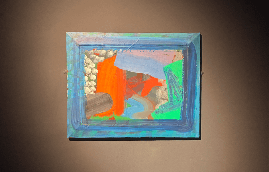
Moving deeper into the Manor, the exhibition begins to highlight Hodgkin’s later works. These pieces often carry the traces of extended making, erasure and return. The painted frames and borders become active elements rather than ornamental ones. In these rooms, the architecture reinforces the paintings’ structural decisions. Many of Hodgkin’s later compositions rely on spatial tension, and the proportions of the galleries heighten that effect.
In several of the central spaces, the viewer is positioned almost directly opposite a single large work. This creates a strong sense of dialogue between viewer and painting. Hodgkin’s surfaces retain their immediacy, even when built up over years. You can sense the precision of each mark, but also the patience. In these rooms, the emotional intensity of Hodgkin’s practice becomes particularly clear.
The Rear Rooms: Colour at Full Strength
As viewers move toward the rear of the Manor, Hodgkin’s palette expands into deeper, richer tones. The natural lighting dims slightly, which has the effect of intensifying the colours. The hang in these rooms is confident but understated. Works are placed to allow the eye to move from one tonal register to another without interruption.
One of the successes of this section is how it shows Hodgkin’s ability to move between heat and calm within a single work. Here, colour behaves almost as light does. It shifts, settles and reasserts itself as you move. The architecture again supports this. The controlled sightlines encourage the viewer to approach each work directly, rather than through distraction or cross-viewing.
How the Exhibition Functions as a Whole
Taken together, the sequence of rooms forms a quiet arc. The exhibition does not push the visitor toward a singular interpretation. Instead it creates the conditions for close looking. Hodgkin’s strength lies in how he registers emotional memory in paint without becoming sentimental. This exhibition respects that. It presents the works clearly, steadily and without unnecessary conceptual framing.
For London audiences, it offers an especially strong context. Hodgkin lived and worked in the city for much of his life. His paintings often refer to interior spaces, meetings, and remembered atmospheres rather than external landscapes. Pitzhanger Manor, with its composed rooms and measured light, echoes those qualities and grounds the works in a familiar sense of lived space.
Howard Hodgkin at Pitzhanger: Shop Highlights
The exhibition shop includes a concise selection of Hodgkin-related items that complement the experience without overwhelming it. The highlight is the A5 In a Public Garden postcard bundle, which offers a close look at Hodgkin’s layered colours and gestural economy. The exhibition poster, magnet and pin badge provide simple, well made keepsakes for visitors who want a tangible reminder of the show.
If readers would like to explore other carefully curated Hodgkin items, we have a bit more info on two highlights, the postcard set and a limited edition print:
- Howard Hodgkin A5 postcard bundle https://coolcuration.com/cool/howard-hodgkin-a5-postcard-bundle
- Howard Hodgkin Indian Leaves (1982/2024) limited edition print https://coolcuration.com/cool/howard-hodgkin-indian-leaves-print-limited-edition
These pages offer useful context for anyone considering adding Hodgkin items to their home, study, or collection.
Why This Exhibition Matters in London Right Now
Hodgkin’s work continues to resonate because it demonstrates how abstraction can remain grounded in emotional specificity. His paintings do not rely on external narratives. Instead they distil the intensity and complexity of personal experience into colour, shape and rhythm. In a moment where contemporary exhibitions often lean heavily on text and contextual framing, Hodgkin’s work speaks through a different kind of clarity.
The Pitzhanger show succeeds because it understands this. It does not overstate its purpose or try to explain the work into submission. It simply creates a strong viewing environment, allowing the paintings to operate on their own terms. The result is a steady, confident exhibition that rewards both returning admirers and newcomers.
More Art & Culture Writing on CoolCuration
- Gilbert & George – God Save the King Print
- EasyK***n – Bold Artist Paint for Creative Projects
- Black 4.0 – Ultra-Matte Black Paint for Experimental Art
- The National Art Pass – Access to UK Art Collections
What's trending




Recent posts
- Best Audiobooks October 2026: 10 UK Listens Ranked
 Ten new audiobooks for October 2026, from a full-cast Dracula with Jonathan Bailey to Russell T Davies reading his own television memoir.
 - Louis Fratino at David Zwirner ReviewLast updated: 4 October 2026 By Tristan · Arts, exhibitions and creative culture This is an opinion piece. Views expressed are the author's own and do not constitute professional advice. Exhibition reviewMayfair Saunas, subway cars and a lot of skin in Mayfair Louis Fratino at Zwirner is the American painter's first solo show in London,… Read more: Louis Fratino at David Zwirner Review
- What Is a Sprive Boost? Seven Days, and What It Actually PaysA Sprive boost lifts your cashback rate for seven days, and it arrives on its own. What mine paid, and why Supercharge is a display toggle rather than extra cashback.


No Comments.