Last updated: 01 March 2026
By Stiv · Design, technology and personal finance
This article contains affiliate or referral links. If you click through and sign up I may earn a commission or referral bonus at no extra cost to you. It does not affect my editorial view.
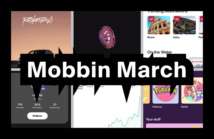
Tracking Mobbin new apps each month is one of the fastest ways to spot where real product UX is heading without scrolling app stores for sport. March's batch is a proper mix: mobility, travel, kids UX, investing and ecommerce. Below, we break down which flows are worth studying and which patterns you can borrow for your own work.
If you are new to Mobbin, start here first: Mobbin review: is it worth it? If you already know you want it and just want the cheaper route: Mobbin promo code.
What changed this month
More consumer-facing flows with real-world constraints: age-gated experiences, regulated money journeys and high-trust booking funnels. In other words, less "pretty UI" and more "this has to work". That shift matters because it is where most real design challenges live.
New apps added (March)
The Mobbin new apps for March include Tesla Robotaxi, Alias (sneakers and apparel), Viator (tours and attractions), Zesty, Stake (stocks) and Spotify Kids. Each one brings flows worth studying, whether you are designing consumer products, fintech or family-friendly experiences.
Three standout flows
1. Booking and confidence-building (Viator)
What to copy: Clear "what happens next" steps before payment. Travel bookings are anxiety machines, so reassurance reduces drop-off. Transparent inclusions and exclusions also help users commit.
What to avoid: Overloading users with options too early (dates, group size, add-ons) before they have committed emotionally.
When it works: Travel, events, services, appointments. Anything time-based where the user needs confidence, not just a price.
2. Kid-safe UX without being annoying (Spotify Kids)
What to copy: Simple navigation that still feels like choice. Clear parental control boundaries that do not require a PhD to set up.
What to avoid: Tiny tap targets and dense text. If your UI assumes adult dexterity, you will get rage taps and "it's broken".
When it works: Any dual-audience product where two user types share one interface. Think kids and parents, users and admins, or juniors and managers. It is permissions UX in a nicer outfit.
3. Regulated onboarding (Stake stocks)
What to copy: Step-by-step identity and eligibility prompts that feel like progress, not punishment. Microcopy that explains why information is required builds trust.
What to avoid: Dumping all compliance questions in one slab. People abandon out of spite, even when they intended to finish.
When it works: Fintech, investing, crypto, credit. If KYC is unavoidable, pacing is the whole game. The FCA's Consumer Duty guidance reinforces this: regulated journeys should be designed so customers can make informed decisions without friction that harms understanding.
Pattern of the month: trust scaffolding
The repeated pattern across these apps is trust scaffolding. Small, frequent signals that tell the user: you are safe, this is normal, you are not about to mess up. Examples include "You can edit this later" around personal details, "This is required by regulation" around identity checks, "Free cancellation / what's included" around bookings, and clear boundaries and guardrails in kids modes.
If you want to see how other apps handle trust scaffolding across onboarding, checkout and subscription flows, Mobbin's flow browser is exactly where to start. For the full breakdown on plans and pricing: Mobbin pricing UK.
Quick swipe file: five UI micro-patterns to borrow
CTA labelling that reduces fear: swap "Continue" for "Review booking" or "Confirm details".
Progress that feels honest: steps should reflect real tasks, not fake "Step 2 of 3" nonsense.
Error copy that explains the fix: "Your postcode needs a space" beats "Something went wrong".
Soft guardrails for upgrades: show what changes and what stays the same when a user moves between tiers.
Review screens that catch real mistakes: a final review should prevent errors, not just repeat inputs the user already entered.
Next month watchlist
Keep an eye on more "real-world products" where UI has to handle logistics, rules and safety. Also worth watching: better patterns for choosing between similar options (bookings, variants, bundles), how brands ship AI features without turning the product into a tool demo, subscription journeys that do not feel like a trap, and parent-admin experiences like family accounts and team permission models.
If you want to follow along with access to the full library, our referral link typically saves 10-20% on Pro or Team:
Mobbin new apps FAQs
What are "Mobbin new apps"?
It is the list of newly added apps and fresh screen libraries inside Mobbin. Tracking them monthly is a quick way to spot emerging UX patterns in real products before they become common.
Is this page a Mobbin discount code page?
No. This is a monthly "what's new" post. If you want the discount route, use our Mobbin promo code page instead.
Where should I start if I am new to Mobbin?
Read the full verdict here: Mobbin review: is it worth it? For a factual overview of the tool, try our Mobbin service guide. If you already know you want it, go straight to the promo code page.
Why do you do this monthly?
Because it is the easiest way to keep a current swipe file of real product patterns. It also helps you avoid designing based on outdated "best practice" screenshots from 2019.
What should I do with the app list?
Pick one flow you are designing right now (onboarding, checkout, subscription, search, settings), then pull five to ten examples across the new apps and compare the patterns. That is where the practical value lives.
More useful reads on CoolCuration
- Affinity by Canva — a free professional design suite that is giving Adobe a proper headache.
- Gift guide for designers — curated picks for the design-obsessed that go well beyond Pantone mugs.
- Daylight Computer — a beautifully different screen for people tired of staring at LCDs all day.
- Best AI assistant UK — how the main AI tools compare for everyday use in 2026.
- Penpot app — open-source design software that keeps getting better with every release.
What's trending


Recent posts
- Nothing Headphone (1) Review: 8 Months On
 Last updated: 21 July 2026 By Stiv · Design, technology and personal finance This review contains affiliate links. If you buy through one of them I may earn a small commission at no extra cost to you. It does not affect my opinion. This is an opinion piece. Views expressed are the author's own and… Read more: Nothing Headphone (1) Review: 8 Months On
 - That Mortgage App on the Channel 4 Advert? It’s SpriveLast updated: 20 July 2026 By Stiv · Design, technology and personal finance I have used Sprive with my Nationwide mortgage since October 2021, making regular overpayments through the app, so this is written from about four years of real use. This article contains affiliate or referral links. If you click through and sign up… Read more: That Mortgage App on the Channel 4 Advert? It’s Sprive
- Bugonia Review: Lanthimos’s Dark Alien ComedyFilm / Opinion2025 Release Bugonia review: a bald Emma Stone, a beekeeper and a very bad week Last updated: 19 July 2026 By Tristan · Arts, exhibitions and creative culture This is an opinion piece. Views expressed are the author's own and do not constitute professional advice. This review also contains an affiliate link. If… Read more: Bugonia Review: Lanthimos’s Dark Alien Comedy