
Last updated: 5 August 2026
By Stiv · Design, technology and personal finance
This post contains affiliate or referral links. If you click through and sign up I may earn a commission or referral bonus at no extra cost to you. It does not affect my editorial view.
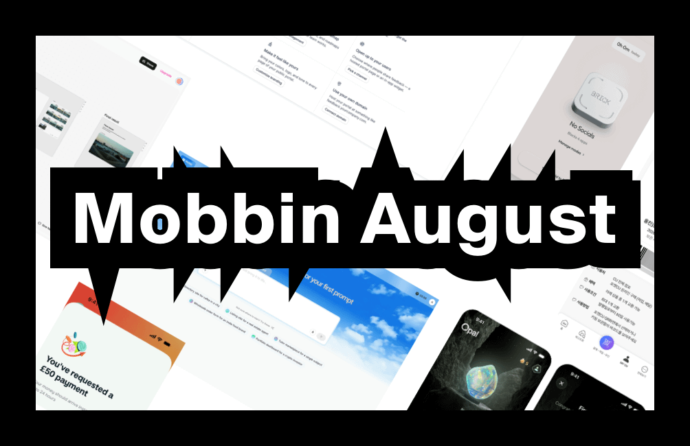
What's new on Mobbin this August
Here is everything new on Mobbin this month, pulled from the Latest feeds I keep open beside my work. August has a clear mood, too. First, attention becomes a design problem. Then the AI studios turn up and try to swallow your entire workflow.
So pour a coffee, because plenty here is worth nicking. If Mobbin is new to you, start with our full Mobbin review, then come back for the picks.
Want a deal on Mobbin Pro?
The current saving on Mobbin's paid plans always lives on our promo code page, kept up to date so you never miss it.
What was new on Mobbin August 2026? The picks are below. For every edition of the series in one place, see our Mobbin new apps hub, updated each month.
What's new on Mobbin this August at a glance
So here are this month's picks, drawn from both the iOS and the Web feeds. Four come from each side.
Section 01 / Attention
Attention becomes a hardware problem
First, the two apps I keep reopening. Both want your phone to be duller, yet they get there by opposite routes.

Brick's home screen: today's total, the puck, and one tap to start a session.
Brick
Brick landed tagged New, and its 112 screens are a small lesson in restraint. The onboarding sets the tone straight away with "Your time is yours. Get back to playing." Better still, the second option under the sign-up button reads "I don't have a Brick", which quietly welcomes people without the gadget. Then the home screen goes almost blank: a big timer, a rendered white puck, and one line reading "No Socials. Blocks 4 apps".
My favourite detail sits in the schedule sheet, though. Alongside a normal start time, the end field can be set to "On Brick Tap". In other words, a physical action closes the session rather than the clock. Brick LLC sells the magnetic NFC puck for $59, with app access included and no subscription.
For the app that hands the off switch back to your hands.
$59 for the device, app included · iOS · New

One score, three sub-scores, and a shelf of gems to chase.
Opal
Opal took the opposite path, and it is gorgeous with it. Its refreshed 208 screens open on a photoreal opal glowing on wet rock, then reveal an arc gauge holding a single Opal Score. Underneath, three pills split that number into Sleep, Focus and Rest. Consequently, one figure carries the whole story while the detail waits a tap away.
Meanwhile the profile page leans fully into collecting. A laurel crest reads "The Focus Company", a streak counter ticks along, and a Gemstones shelf shows how rare each one is, from Pride at 23% to First at 98%. Opal calls itself "attention on autopilot" and reports 4.8 stars across more than 150,000 ratings.
For turning a nagging habit tracker into something you want to open.
Free, with Opal Pro · iOS · Updated
If quiet is the goal, hardware helps as much as software. Our Loop earplugs review covers the analogue half of that job.
Section 02 / AI studios
The AI studios stop being single-purpose
Next, the web feed. Two arrivals show the same ambition, namely to be the only tab you keep open all day.

Magnific's Spaces canvas: input brief, texture step, final result.
03 For the whole-workflow crowdMagnific
Magnific is the biggest drop of the month by a mile, at 898 screens. That heft makes sense once you know the backstory, because Magnific is the rebrand of Freepik. As the company puts it: "Freepik is now Magnific. Same team, same technology, redesigned as a full AI creative platform."
Design-wise, the dashboard is the bit to study. A warm "Good morning, start creating" greeting sits above six flat tool tiles for Spaces, Image, Video, Audio, 3D and Stock. Below that, three panels split Projects, a Create a space prompt and a Tools shortlist. Elsewhere, Spaces gives you a node canvas that wires an input into a texture step and out to a final result. Then the editor swings the other way entirely, with a right rail of Opacity, Mask, Fill, Border and Shadow controls that would look at home in Figma.
Above all, it manages to hold a stock library of 250 million assets and a node-based canvas in one calm interface. That is a genuinely hard layout problem, solved well.
For proof that a huge product can still open on a quiet screen.
Free tier, with paid plans · Web · New

Blue sky, one prompt box, five oddly specific starter ideas.
Emergent
Emergent arrived with 151 screens, and the home page is pure blue sky. Literally, in fact: clouds fill the background behind a single prompt box. Then the greeting leads with generosity rather than features, reading "You have received 10 free credits for your first prompt". A sister screen says it even better: "Start with one prompt. You can change everything later." Both lines do the same job, since they remove the fear of picking wrong.
Then the suggestion chips do the rest. Instead of vague prompts, you get five oddly specific ones, such as "Wholesale order form for an indie food brand" and "Portfolio dashboard for a crypto investor". Later screens show a task table, a community Showcase and an agent chat with a live App Preview beside a Deploy button. A credits counter sits in the corner throughout, so the cost never hides.
For the empty state that tells you exactly what to type.
Free with 10 monthly credits · Web · New
The best empty state this month is not empty at all. It hands you five ideas and gets out of the way.
Section 03 / Under the bonnet
Developer tools keep out-designing consumer apps
Meanwhile, the unglamorous end of software carries on quietly winning. Two new web entries prove the point.

The canvas stays put while the metrics panel slides over the top.
Railway
Railway calls itself "the all-in-one intelligent cloud provider", and it already claims more than two million developers. Its 245 screens also earned a rare 5.0 rating from early raters on Mobbin.
The star is the canvas. Rather than a settings tree, your stack sits on a dark dotted grid as connected cards, so a todo-api box points at a Postgres box with a volume attached beneath. Click one and a panel slides over with Deployments, Source Code, Variables, Metrics and Settings. Naturally the metrics view charts CPU and memory side by side. Even the trial banner behaves, reading "24 days or $4.91 left" in a thin amber strip rather than a modal.
For infrastructure that finally looks like a map instead of a form.
Trial credit, then usage-based · Web · New

Statuses down the left, votes and priority on every row.
Featurebase
Featurebase brought 265 screens of feedback tooling, and the voting model is the clever part. A feature request does not just collect upvotes. Instead, each post carries three separate scales for Usage Frequency, Urgency and Importance, which stops one loud customer skewing the queue.
The rest is tidy too. Statuses run Under Review, Planned, Active, Done and Closed down the left rail, and a Main Roadmap board sorts work into Backlog, Next up, In Progress and Done. There is an Ask AI panel as well, offering chips like Dealbreakers and Usability issues before returning a ranked list of recommended priorities. Featurebase says it serves over 1,500 customers across 186 countries.
For splitting one vote into three questions worth asking.
Free tier, with paid plans · Web · New
Section 04 / Everyday
Everyday apps sweat the awkward moments
Finally, two apps people actually open in a queue. Both spend their design effort on the fiddly bits.

The confirmation screen worth copying: instant, but honest about 24 hours.
Monzo
Monzo sat top of the iOS feed this month with 595 screens, and it is the most British thing on the list. Its coral cards stack up on the home screen, while the Add money flow pulls funds in from another bank. Crucially, the consent line says what will happen before you tap.
The confirmation screen is the one to copy, however. It leads with "You've requested a £50 payment", then sets expectations honestly: instant, but possibly up to 24 hours. Elsewhere, a transaction detail page shows the exchange rate as a sentence rather than a footnote, and offers to take the money from a Pot after the fact. That retroactive tidy-up is a lovely idea. For a wider look at the category, see our best banking apps in the UK roundup.
For a confirmation screen that promises exactly what it can deliver.
Free account, with paid tiers · iOS · Updated

The keeping locker: one stored item, an expiry date, and a barcode to claim it.
PocketCU
PocketCU is the app for Korea's CU convenience stores, and its 466 screens are a riot of colour. Bread coupons, flash pop-ups and character collaborations all fight for space, yet the tab bar stays firm. Pickup and delivery sit as a simple toggle on every product page, too.
One pattern really stands out, though. A "keeping locker" holds the items you bought on a two-for-one deal but did not carry home. Each stored item shows a barcode, an expiry date and a days-remaining counter, so you can claim it later at any branch. Consequently, a fiddly promotional rule turns into a tiny, tidy inventory screen.
For turning a confusing offer into something you can hold in your hand.
Free · iOS · New
Everything new on Mobbin points the same way
Look across the eight and one theme keeps repeating. Namely, the interesting work now happens at the moment of commitment. Brick ends a session on a tap. Monzo tells you when the money really lands. PocketCU turns an unclaimed offer into a barcode you can scan.
So the craft has moved past the home screen. Instead, it sits in confirmations, empty states and the awkward gaps between promise and delivery. That matches Jakob Nielsen's visibility of system status heuristic rather neatly. For the platform-specific detail, Apple's Human Interface Guidelines remain the reference worth keeping in a second tab.
How Mobbin works: free versus Pro
So how does the platform itself shake out? A free account lets you browse the newest apps and build a small handful of collections, which suits a casual skim. However, the full searchable library, advanced filters and every flow sit behind a paid plan.
I checked the live pricing on 5 August 2026. Pro costs £8 per month billed yearly, which Mobbin frames as roughly £0.26 per day, and yearly billing saves 33% against quarterly. Team, meanwhile, runs to £12 per member each month on yearly billing. Mobbin also still runs its Invite and earn referral scheme. Do check before you commit, though, since plans can change.
For a full walkthrough of every feature, our Mobbin service guide covers the lot. Alternatively, save a few pounds first.
Catch up on the series
Curious how the picks are shifting? Last month brought Grok, Zip and Laravel Cloud, and you can read the lot in the July Mobbin roundup. Read the two together and the direction becomes obvious.
FAQs
What is Mobbin?
Mobbin is a design reference library of real, shipped app and website screens. Its team curates and updates it constantly, so designers can study proven flows rather than reinvent them. In practice, it works like a swipe file that never runs dry.
What's new on Mobbin in August 2026?
The standouts are Brick, Opal, Magnific, Emergent, Railway, Featurebase, Monzo and PocketCU. Four arrived on the iOS feed and four on the Web feed. Magnific is by far the largest drop, at 898 screens.
Is Mobbin free?
Yes, up to a point. A free account covers recently added apps and a small number of collections. However, full search, filters and the complete library need a paid plan, so regular users tend to upgrade.
How much does Mobbin Pro cost in the UK?
Pro was £8 per month billed yearly when I checked on 5 August 2026, and Team was £12 per member each month. Mobbin frames Pro as about £0.26 a day. Prices can move, so confirm on the pricing page first.
How often does Mobbin add new apps?
Constantly. Both Latest feeds refresh through the month with new and updated entries, which is exactly why tracking what's new on Mobbin monthly keeps your references current. As a result, you spend far less time trawling app stores yourself.
More from CoolCuration
- The best AI assistant in the UK, tested properly so you can pick one and move on.
- 1Blocker, the content blocker that makes the web quieter on iPhone and Mac.
- The Daylight Computer, a glare-free screen built for calm, focused work.
- Gifts for designers, thoughtful picks for the person with strong opinions on fonts.
- Affinity by Canva, worth a look before you renew that Adobe subscription.
What's trending


Recent posts
- Philips OneBlade Review UK: 4/5 After Five Years
 Five years with the same Philips OneBlade. One handle, a new blade every four months, and blades that work out at £1.65 a month. Here is what wore out, which blade I stopped buying, and the one design flaw that will eventually kill it. #philipsoneblade #grooming #shaving #ukreviews #coolcuration
 - Best Smart Home Starter Kit UK 2026: Apple, Google or AlexaThree ways into a smart home and one box you replace if you change your mind. Apple, Google and Alexa priced side by side, plus the Matter kit that works with all three.
- Best Refurbished AirPods UK 2026: Where to Buy and What It SavesRefurbished AirPods UK prices at Back Market, Amazon Renewed and Apple, set against the cheapest new price at Argos, AO and Currys.
No Comments.